Loopy Pro: Create music, your way.
What is Loopy Pro? — Loopy Pro is a powerful, flexible, and intuitive live looper, sampler, clip launcher and DAW for iPhone and iPad. At its core, it allows you to record and layer sounds in real-time to create complex musical arrangements. But it doesn’t stop there—Loopy Pro offers advanced tools to customize your workflow, build dynamic performance setups, and create a seamless connection between instruments, effects, and external gear.
Use it for live looping, sequencing, arranging, mixing, and much more. Whether you're a live performer, a producer, or just experimenting with sound, Loopy Pro helps you take control of your creative process.
Download on the App StoreLoopy Pro is your all-in-one musical toolkit. Try it for free today.
Comments
Yes of course, pretty aware it's becasue of this "missing feature" Sometimes less is better
Agreed it’s easily one of the best. I do wish they’d implement something like TB did with Flowtones where you can control how “usable” it is so we can easily get some experimental and drone patches too.
I’m more into making my own presets but I’m a sucker for a good randomizer.
It’s about 350 sq ft total, including the porch area. So a pretty tiny space 😅 I’m excited though!
Smaller than my flat. 😅 But yes, I do love my flat. Not much wiggle room for anything extra, but it's cosy here.
Yes! You would also be great! Too many shitty beta testers lol
Good demo.
Thanks Slush, I hope people will see that it is EXTREMELY objective. Many people thinking that Youtubers don’t talk about the negatives. It’s often true, but I ,for one, do not fall into that camp. Plenty to like, plenty that could be improved. Devs need this kind of frank criticism, and public platforms like YT are the best place to put it to ensure that they - and other devs - try harder. Desktop JUCE ports are especially guilty of multiple UI / UX fails.
Gavin, I always like your videos, and good you stipulate the cons if necessary. But even if you where not objective I still would make up my own mind. For me, explanation of the synth and a run through the sounds is enough to judge if it’s for me or not.")
I took the time and made a mockup, so we can all see what will be so bad if they enlarge fonts more than 3 times. Also made faders more visible and worn those scales. Don’t judge, because I will hunt you in your nightmares.")
Before:

True!
That is quite a lot better, though you only enlarged the top labels - all the labels at the bottom will still be illegible for many users. I really hope Baby Audio improve in this area. Thanks for doing this!
Those on/off side labels also enlarged, more than top ones.
Either way, I’m seriously hoping for a god damn enlarged font update from Baby Audio!
Yamaha cs01 (not Casio:)
Yes! Already corrected that in the vid description etc, but thank you anyway!
before you pull the trigger watch those demos to get idea where those synths are sonically .. they are very different
(btw. none of them has build in FXs so the delay/reverb you hear was added during recording)
I think every one of those is extremely worth the money and you will hardly find on iOS something which can match them in whole sound range they cover. Maybe some speciffic sounds, but as sooon as you start apply more extreme modulations, as soon as you crank up resonance - there is just huge mojo on analog synths.
Also the factor of physical knobs is.. at least for me STRONGLY inspirational. Can't be compared with midi controller, it's just something else..
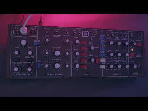
Behringer Model D
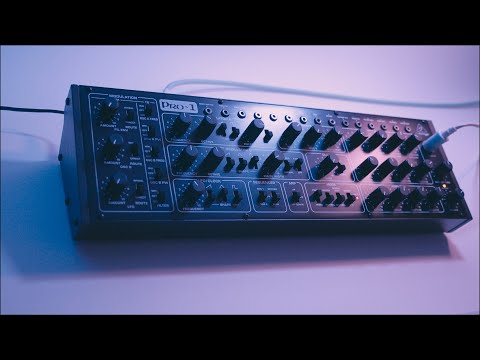
Behringer Pro-1
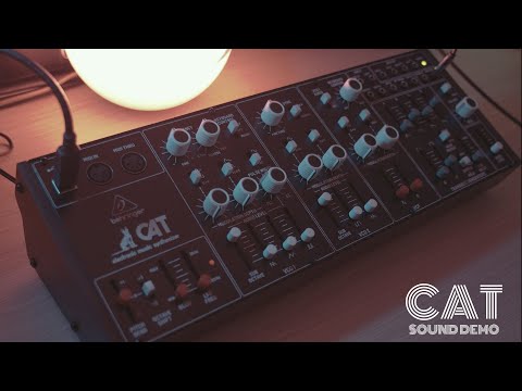
Behringer Cat
Behrinter K2
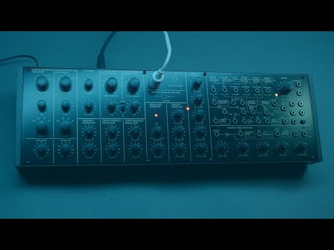
those all are monosynth, all in approx same price range
this one is slightly more pricey but has build-int amazing FX unit. Also monophonic
Then this one is 6 voice polyphonic (fully analog), no FX except of mono reverb which is not much useable") )
)
Basically all those are for our purpose mentioned as sound source which you sample into iPad and use apply some FX plugins on them")
Cheers mate.") Thanks for the infos.
Thanks for the infos.
From pure synthesis capabilities perspective there's no real need, this app is all about the 'sound'.
For me, lately, Twin3 kinda steal the show from others. But Zeeon is here to stay for a long time.")
they replied to an email and said a fix is in house and will be rolled out shortly.
My spirit rejoiceth.
Nice work!
But designers like lots of "space" around things. Looks pretty.
Doesn't matter to them if nobody can actually read the text. As long as it looks pretty.
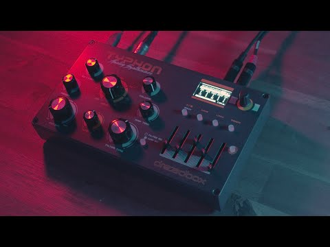
Man I want the Typhon so bad. Have since it came out. I’ve had terrible luck with Behringer synths so I don’t think I’ll ever use one again. I’m still undecided on what bit of hardware I wanna get but the Uno synth is in the lead simply due to space being such an issue. I am tempted to buy a Minifreak instead though.
Yeah I’ve always found smaller spaces to be more cozy. And I like the idea of “nothing extra”. All we have is either what we need or what we absolutely love. It’s interesting to see what you get rid of and what you can live without. Music wise I’m set with just my iPad but I am planning on getting one small hardware synth (probably an Uno synth pro or Minifreak) just for the fun of jamming with it and to bring to friends places to make some music there.
Thank you @Simon!
About Baby Audio, I love their graphics design. 🤩 It's really inspiring to me. For instance GUI from Crystalline, pure example of how simplicity, functionality and beauty can work together perfectly.
But, what I think in the case of BA-1, they decided to take the retro route, ended up with too many text labels and then gave up at some point. I’m not judging them, deadlines, release pressure and all that jazz. Look and feel of BA-1 is actually beautiful, just that little finish touch.
Did this mockup because of forum talks and curiosity, because talk is one thing and actual visual representation another. All this is just a glorified whining, because our sight is not what it used to be. 🥸
You should sent the mockup to Baby Audio, you never know.. i think objectively your mockup looks MUCH better than original ! Maybe they will get inspired and update UI
Or maybe a regular & bold setting for the font.
It really would be good if ANYONE AND EVERYONE who thinks the text is too small, especially with the app at smaller sizes, email Baby Audio and complain. Only if they understand the strength of feeling is it likely they will reconsider their future designs. I'd be surprised if existing apps get a UI overhaul, but if at least future apps come out with more legible labels even at smallish resizes, that would be a win of sorts.
I've only got the BA 'freebies' and Crystalline for now and thankfully all Crystalline presets can be easily accessed from elsewhere within my host of choice making the built-in preset browser kinda redundant.
Don't plan on creating, saving and sharing any user-presets in it and it's easy enough to tweak on-the-fly when needed.
With that said I am a bit 'allergic' to form over function UIs even though I can sometimes make exceptions...