Loopy Pro: Create music, your way.
What is Loopy Pro? — Loopy Pro is a powerful, flexible, and intuitive live looper, sampler, clip launcher and DAW for iPhone and iPad. At its core, it allows you to record and layer sounds in real-time to create complex musical arrangements. But it doesn’t stop there—Loopy Pro offers advanced tools to customize your workflow, build dynamic performance setups, and create a seamless connection between instruments, effects, and external gear.
Use it for live looping, sequencing, arranging, mixing, and much more. Whether you're a live performer, a producer, or just experimenting with sound, Loopy Pro helps you take control of your creative process.
Download on the App StoreLoopy Pro is your all-in-one musical toolkit. Try it for free today.
Comments
but why is it working for all the other plugins i use?
i see. no problem for me anyway
Maybe it has something to do with Catalyst. Maybe there is something that can be done on MacOS after all then. I guess things aren't the same on MacOS as on iOS/iPadOS where there's nothing that can be done. (Though Loopy Pro does some clever hacks to make it a little easier to manage.)
i am confident that there is an solution. i use several plugins that run on ipad and mac without that behavior, e.g. spatializer. it's not a big deal anyway just keeps me from using battlestation on mac often i guess
Well, this is unexpected.
I've learned more about making techno in two days with this app than I did in years of messing around with other apps. The pieces finally clicked into place. I now "get it" much better for making techno in general with other apps.
I’ve gotten it too from this app. I mean… I’m not a huge techno person… but I like some of it. This app is just the right balance to get someone like me into the techno mix")
@brambos any chance of making the steps length entry for the synth parts draggable, like the tempo display? I’m finding it can be a good performance control
Would it make sense to have the memory buttons accessible twice? I find I am often switching between the mixer and the memory buttons, and there would be space to the right of the mixer to make the 6 memory buttons available without having to go up. Might look ugly though, not sure.
Also, I guess if you moved the drum FX and the synth FX to be on both sides of the mixer (which would conceptually still make sense), maybe you could avoid the arrow? You probably tried this already though and it didn't work, darn.
First "housekeeping update" is live. No spectacular new features, just useful fixes and improvements
(I want to get these out the door before the App Store reviewers go on their holiday break)
Now diving into the AUVal shenanigans. It's ironic that AUM is more compliant with the AUv3 specs than Apple's own validation tool
Yes, I noticed that upon release and thought it was a nice touch.
(Previous image of info about Turning machines removed as apparently it was wrong)
That quote about Alan Turing is wrong (except for the first sentence) and the "Turing machine" style generators that are included in Battlestation have nothing to do with Turing's idea. It's just that someone who developed a hardware module with this capability thought it was a cute name.
Apologies @plragde, I was only being mischievous by suggesting that there’s perhaps a fine line between being generative and AI generated. I will presume you are correct, bow to your superior knowledge and delete the post.
You're right, there can be a fine line (though it is rather a broad gulf in this case), and I certainly indulge in a little mischief myself now and then. I might be overly sensitive on this point since the original Turing machine looms large in my day job (theoretical computer scientist).
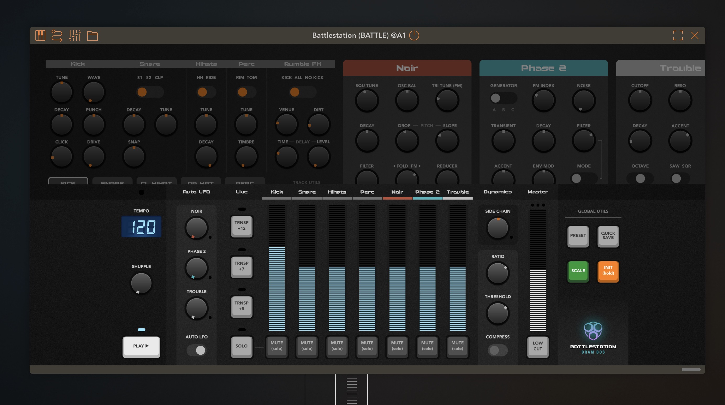
Love the update, especially swiping across the top. Just to throw a thought out there @brambos - on my 11” ipad m3, it looks like there would be space on either side of the mixer to move the rightmost top panels down: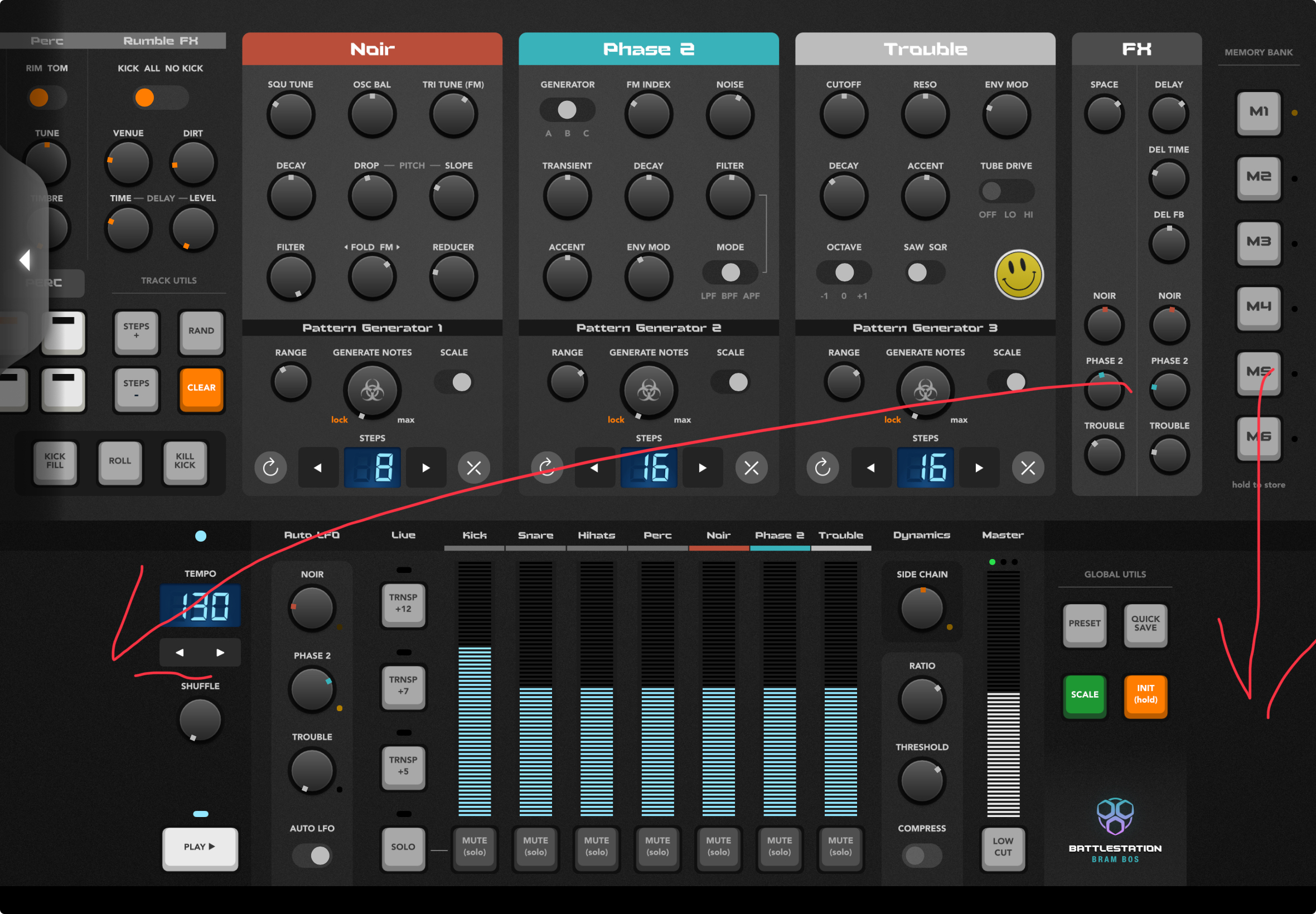
That would make for even less scrolling of the top panel.
Yeah, I've wondered why that's up there, when there's all that spare space below.
Also, I find having the play button, and tempo selector at the bottom a bit weird - usually these are in a bar along the top for quick access in most groovebox/DAW's. I find it a bit awkward jamming away with the synths at the top, and then having to scroll down to stop play - meaning there's a bit recorded at the end I don't want.
Don't know if anyone else has mentioned this, but I'd also like a bus option in the mixer (or maybe a power button, for the drum panel itself?) to mute all the drum channels similtaneously. It's nice to be able to switch out the drums and keep the iunstruments going for a couple of bars, then bang - bring the drums back in. Having to select them one by one dilutes the impact a bit. Maybe a bus for the instruments too for drum solos.
Still 5 stars worth of fun though.
That lil gap makes it easier to minimize, I reckon.
It all has to do with managing the visual complexity. Don't underestimate the power of empty space and negative space")
A lot of my design time was spent just staring at the UI and figuring out where visual complexity and clutter was too much and where I could possibly reduce it.
The bottom panel is already a bit of a dog's dinner in terms of variety of controls, and many of these wouldn't work on a consistent grid either.
So the empty space is there to make everything look a bit less intimidating and daunting at first glance (the 'face value simplicity' which the lizard part of your brain is judging before the analytical part of your brain starts processing it).
So yeah, there are good rational reasons for moving some of the elements around, but I try to balance the rational with the subconscious/perceptual when I design my UIs")
I understand where you’re at with that @brambos. Point is, when I’m done looking at something and admiring it, and start using it, I value functionality over aesthetics, always.
I was not talking about aesthetics")
Yep..
Or, making it ‘floatable’..
looking forward to the color indication for loaded ‘snapshots’..
Saw it in the new update… make a big difference… Thanks
The new update is great. I find it useful to have both scrolling options (headers and arrows). Scrolling via header for devices, arrows for going back and forth between drums and FX bus.
Because this is what we do on the AB forum, I'd love to see TRNSP +7 and TRNSP +5 changed to increment 1 semitone up and down
Cool 😎 thx 🙏
Probably too much work, but any chance of a VST 3 version of the plug in for the desktop please?
Lots of Mac users out there use Cubase ( which doesn't host AU )
Thanks!
When the rational involves empty and negative space, and managing visual complexity, you’re circling around aesthetics vs usability. If the UI is sacrificing functionality and accessibility for that decision, ultimately the tool is going to be harder to use as some of the functionality requires a movement (top swipe/side scroll in this case) that doesn’t contribute to the end goal, which is modifying the controls and changing the output.
If the goal of this interface is to put as much function in front of the user as possible; moving those panels would contribute to that goal. In the OP of this thread, it was stated that “it is designed for speed, fun and accessibility. All controls are laid out on a single screen, so no menu diving is required.” If that’s the goal, then moving as much control to a single screen without scrolling would accomplish that.
FWIW, I love the app, it’s a blast to use.
When there is discussion about this particular detail, i add my 5 cents.. having FX knobs (especially amount sends) in bottom part will make possible to make trasition trick where you mute drums, slowly add delay amount on some synth track to get “riser” effect and then in second you just tweak fx send back to zero and simultaneously unmute drums for hard beat drop :-)
On other side, there are situations when it is really better when FX knobs (again, especially send amounts) are in top screen where they are now.. so hard to choose. Every one has pros and cons.
~~~~> @wim said:
Wonder what it would be like with MiDi import? Importing a Drum, Bass and Melody midi parts with the Scale Quantize may change the whole concept of the app..
Just bought this magnificent all-in-one Bram Bos wonderbox. It works perfectly, and I love it! 🤩
My only gripe is the two-page UI. First of all, it’s not one page, as many people call it, it’s in fact a two-page plugin with a weird side-switching tab button. And these empty spaces on both bottom corners do not portray the UI to be less intimidating, on the contrary, they look like missing content and unnecessary distractions.
When I tried to enlarge the plugin window (on the desktop), I expected to see this promoted ‘all-in-one’ page, but instead this half one even got truncated at the bottom. Am I doing something wrong? 🤦♂️
Anyhow, sound and sound controls exceeded my expectations, and I’m happy to finally have this tool on my desktop Logic Pro.
Desktop works in mysterious ways apparently. Now I remember why I never bothered with doing desktop versions
That’s a logic window? It should not be showing the overlap mode but the full screen mode. Can you resize it or will that keep the same aspect ratio? I’ve only ever seen it show the full thing in Logic.
The interface works fine for me. Once I knew that a tap here or there would get me where I wanted to go it became second nature. The added swipe gesture does nothing for me. The side buttons are right under my thumbs. A tap takes me to the upper section of the app and another tap to the bottom section. I think it’s pretty intuitive. I don’t need to see everything on the screen because then certain elements become too small. @brambos
@brambos
somebody reported here problem when left scroll arrow is missing … i managed to 100% reproduce it, just in case you did not yet:
1/ start with plugin view where you have to switch between top rack and mixer view
2/ switch to mixer view
3/ now resize plugin height to the level where both top rack and bottom mixer are shown active (not needed ro switch between them)
Now - you see full pligin but scroll arrow is not there
screenshots:
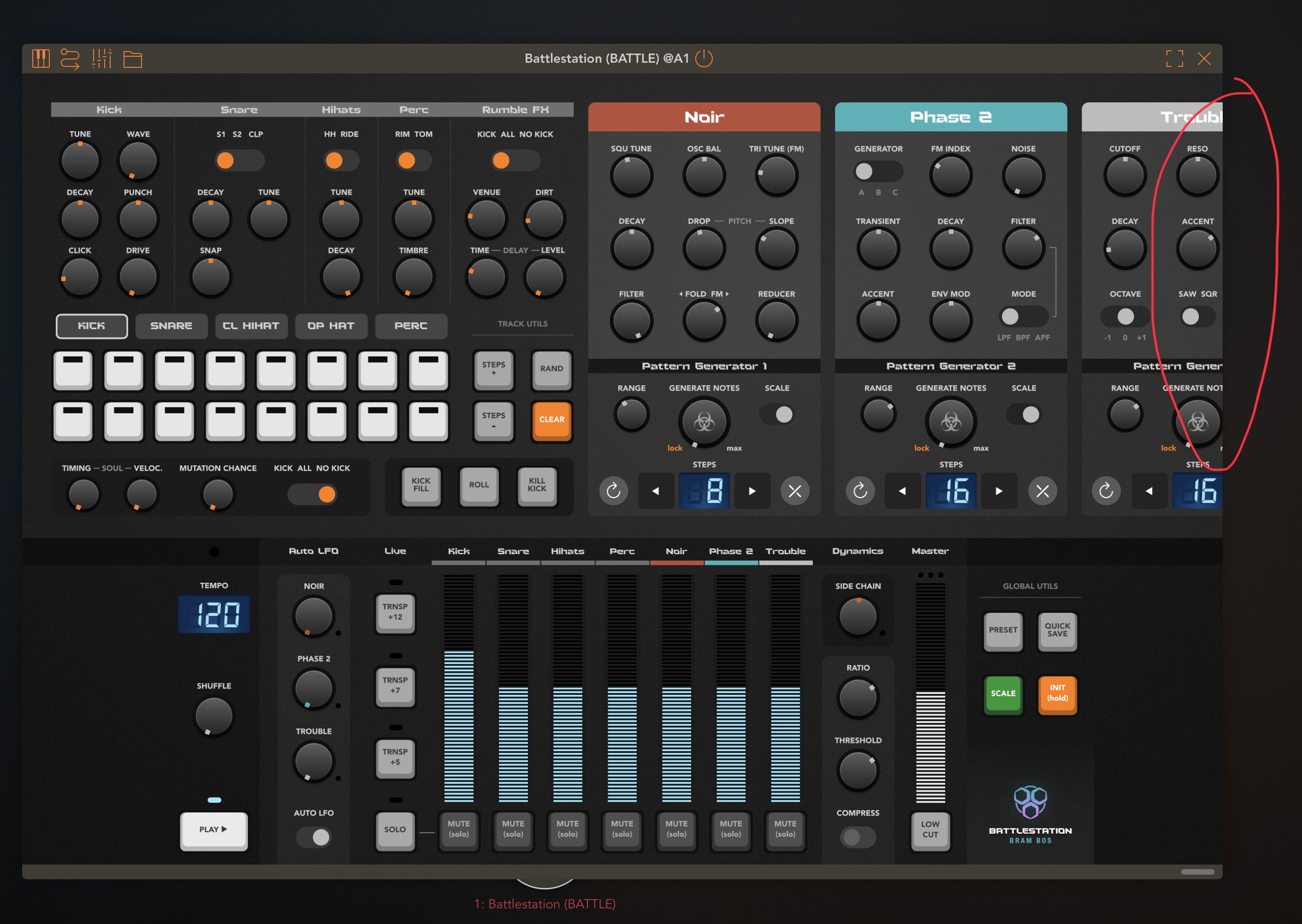
start here:
after height was enlarged: