Loopy Pro: Create music, your way.
What is Loopy Pro? — Loopy Pro is a powerful, flexible, and intuitive live looper, sampler, clip launcher and DAW for iPhone and iPad. At its core, it allows you to record and layer sounds in real-time to create complex musical arrangements. But it doesn’t stop there—Loopy Pro offers advanced tools to customize your workflow, build dynamic performance setups, and create a seamless connection between instruments, effects, and external gear.
Use it for live looping, sequencing, arranging, mixing, and much more. Whether you're a live performer, a producer, or just experimenting with sound, Loopy Pro helps you take control of your creative process.
Download on the App StoreLoopy Pro is your all-in-one musical toolkit. Try it for free today.
Comments
Hahaha
Same here. Being able to use an iPad in a more "Mac-like" way will solve a lot of regular user problems.
From the demos I've seen I can imagine they're going to be solving a lot of the long time complaints people have had about iPads.
I feel your pain! I’m the opposite, hoping 3rd gen will have enough new stuff to make the wait worth it 😂
The windows might be marginally handy. The rest … yuck.
I’ll die before I use that persona shit. Might die from disgust as people I have to deal with start to in my face with that. I literally cringe when I see the one my wife somehow made.
Hate the glass look.
Maybe my iPad won’t be compatible. One can hope.
I never thought I’d say this, but Apple is completely lost at sea.
They know their market though. It’ll probably be a huge hit.
I am not their market any more. That’s fine.
Part of the problem Wim, and I'm sure you're aware of this, is the constant compulsion which many people in corporations have, to be seen to be doing things, to be seen to be innovating. Sometimes it means that shit actually gets worse. The horrible update the Books app got a few years ago is a case in point. They made some changes that no one in their right mind could regard as improvements, and which messed with years of muscle memory.
I seem to remember there was an option to turn off transparency in Windows, when they did this with Vista, as there was a performance hit. If Apple don’t provide the same option, this will be another slowdown for older devices.
I think the Liquid Glass thing will be fine. People aiming for clicks online are deliberately playing with colour settings to make it look unusable.
Ah haha, that sounds feasible actually, it's really hard to imagine Apple would let that thing out the gate, some of those screenshots show such clearly bad design
It's something you have to toggle on. It won't be turned on by default.
I'm sure there will be a few tweaks!
Interesting little counterpoint to Ipados 26 here:
https://www.fastcompany.com/91349280/apple-just-turned-the-ipad-into-a-mac
I read this earlier Dan. I'm not sure I agree with him, though it was pretty thought provoking. I think we'll still have apps doing their own little things in their intuitive and self contained way, but it really does make sense, for me anyway, to have robust file management, multiple windows etc!
Haven't kept up with the thread, but can we please appreciate how Apple went from:
iPhone OS, 2007:
"Look at this beautiful skeuomorphic UI we made! Revolutionary!"
to
iOS 7, 2012:
"Screw skeuomorphism, everything has to be flat! Absolutely Gorgeous!"
to
iOS 5000, 2025:
"Liquid Glass! Skeuomorphism! Unbelievable!"
? 😂
(BTW: I actually LIKE the new design and have never been anti-skeuomorphism. It's just that Apple's insecurity is funny!)
The effects in the new UI are processor intensive and won't be easily duplicated by lesser GPUs in cheap phones and devices. It's really about product differentiation. This update will make older and competing phones look primitive in comparison.
Yes, good point. Still. It shows insecurity and inconsistency in UI/UX design.
I mean, just look at this:
I’m not installing a beta, but is the level of defocusing of the background adjustable?
People might be insecure, but a company isn’t. They have to compete and if what they offer doesn’t work, then they have to fix it or lose customers.
And to fix it they place the identical "Edit" button, for the identical functionality, in two identically structured apps, once on the left and once on the right? 😂
This is still in beta. It's not even finished yet.
That's a screenshot from iOS 18 😁
The shot on the left is iOS 18. And it's fine. The shot on the right is iOS 26, which is still in beta. I have iOS 18.5 on my own iPhone.
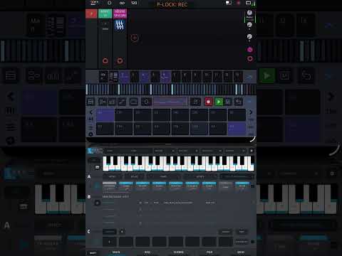
Cool you can now put your samples folder in the dock ! And colour code folders.
I can totally get that, I rarely if ever use even split screen, but then I have a mini. I think you are right about the apps though! It is a kind of interesting take though
@sevenape This was done on a mini. From ipadbeatmaking. In portrait mode.
I don't think Android will ever sort its shit out for music apps, but I switched completely to Android phone and tablet for near everything. Only thing I use iPad for anymore is music production, and literally that's it. I'll probably jump ship 💯 to Android once FLSM's bugs are ironed out.
(I'm currently typing this on my S25 Ultra, lol.)
Nope. They designed it for stupid ahem, everyday people. 😂 I'm obviously not Apple's target audience.
Ahahaha! 😂🤣🤣
Is that confirmed?
I’ve seen examples where users can tweak the settings, but it still looks ropey (what planet was their design team living on, when they thought thin edge highlight borders was a good idea on a tiny mobile device?), and some beta testers are reporting big performance hits.
The Mac OS style functionality for iOS will be great (no more sliding-over cludge for dropping samples, for example), but I really hope the accessibility improvements are better than what’s currently being provided, and it’s not another example of built-in obsolescence for older device owners.