Loopy Pro: Create music, your way.

What is Loopy Pro?Loopy Pro is a powerful, flexible, and intuitive live looper, sampler, clip launcher and DAW for iPhone and iPad. At its core, it allows you to record and layer sounds in real-time to create complex musical arrangements. But it doesn’t stop there—Loopy Pro offers advanced tools to customize your workflow, build dynamic performance setups, and create a seamless connection between instruments, effects, and external gear.

Use it for live looping, sequencing, arranging, mixing, and much more. Whether you're a live performer, a producer, or just experimenting with sound, Loopy Pro helps you take control of your creative process.

Download on the App Store

Loopy Pro is your all-in-one musical toolkit. Try it for free today.

Branches - Semi-modular synth by Willow & Oak AB

1235

Comments

  • edited November 2020

    @kennylovrin I like the grid system of apeMatrix, but I don't mind the cables. I've never really taken to modular stuff on the iPad (as much as I've tried), but this Branches app is just the right amount of possible variations in sound, while not being overly complicated to understand. I still don't completely understand it all, but I'm getting closer.

    I also like the way connections are done in the Shockwave app. It's not wires or grid.

    I'm really enjoying it so far and glad I took a chance on yet another modular-like app. I'm finally actually having fun with this one. :)

  • @kennylovrin I would suggest keeping wires in one form or another. They come with their own issues but it's something that makes Branches special: in iOS, only mirack, ripplemaker, and audulus (that I know of) use wires, against basically all the other synths which have matrix-type interfaces.

    I have a couple of reservations with drambo's "quantum" method: it works well with the automatic connections, but adding any type of extra modulation makes the patch grow horizontally in a way that becomes a bit unmanageable.

    Wires don't need to be realistic but they do have to be functional: show how a patch is made; make connections with maximum two interactions; allow for "wrong" connections ("what happens if I plug this here?"), allow as many connections as desired, etc.

    Currently, the wires are a bit too thick and they're tricky to disconnect, and they tend do be become confusing if they overlap. There's a lot of discussion in the mirack threads about cable colors which might be worth keeping in mind, but that won't be as important with a simpler app like Branches. Max/msp, PD, and audulus work with something like abstract cables that distinguish between CV and audio-rate signals, which would be useful.

    Those are my two cents!

  • @kennylovrin said:

    @Liquidmantis said:
    I hope you get some interesting feedback on this. To me, wires are both a nice instant visualization, but also maybe a skeuomorphic romantic affectation. They can get in the way, cause visual clutter, and be difficult to reroute. I don't want to be a "every problem can be solved with Drambo!" drum beater, but I do like the approach Drambo has taken to "quantum" connections.

    I haven't used Drambo, so not sure what you mean here, but I will look into it. I was thinking of a "tap the jack, show a popup with potential destinations" UI as well, is that what you mean? Problem with my thought there is that you can't really see a patch.

    Conceptually, exactly that. Drambo doesn't physically have jacks but rather UI hints of things that can be modulated/affected and indicators for things that are connected. If you stick with the jack symbology, maybe they can be color coded to indicate connections, and even a quick toggle to show or hide the wires? Then you end up with the best of both worlds and support for either preference (and even fence-sitters).

  • @kennylovrin said:
    By the way, I have a question. I might regret asking this, but I'll do it anyway and then I'll have to take a decision later:

    Those of you that have used Branches so far, and other modular-style apps would you prefer a Synthi-style patch matrix instead of dragging "cables" around? A patch matrix (in this case) is unlikely to fit on screen at all times, so imagine tapping a button to open it in some sense. Aum is using this type of patch layout as well for example.

    You would think I prefer cables for obvious reasons, but actually I don't like it, but I don't quite like a patch bay either as it easily gets huge (I've tried both in fact). So why not ask the users and see what they say.. :)

    Cables please!

  • Ok cool, the reason I opted for cables after trying both is actually because I also think it's the one visualization that is the easiest to understand, but obviously the downside being that they're all over the place like mentioned as well.

    I used to have them color coded, and they're supposed to be, I just had some issues with it and decided to drop it for the release, but it will return.

    I'll think I'll stick to cables then, and try to tweak that experience as best I can.

    Thanks for the input!

  • @kennylovrin said:

    Thanks for the input!

    No pun intended, I suppose?

  • @kennylovrin said:
    Ok cool, the reason I opted for cables after trying both is actually because I also think it's the one visualization that is the easiest to understand, but obviously the downside being that they're all over the place like mentioned as well.

    I used to have them color coded, and they're supposed to be, I just had some issues with it and decided to drop it for the release, but it will return.

    I'll think I'll stick to cables then, and try to tweak that experience as best I can.

    Thanks for the input!

    maybe you can add "transparency" to the cables (0-100%)

  • @Synthi said:

    @kennylovrin said:
    Ok cool, the reason I opted for cables after trying both is actually because I also think it's the one visualization that is the easiest to understand, but obviously the downside being that they're all over the place like mentioned as well.

    I used to have them color coded, and they're supposed to be, I just had some issues with it and decided to drop it for the release, but it will return.

    I'll think I'll stick to cables then, and try to tweak that experience as best I can.

    Thanks for the input!

    maybe you can add "transparency" to the cables (0-100%)

    +1 for "transparency" to the cables

    I also like Model 15 patching method by double tapping output, then input. Specially if scrolling is going to be part of the UI.

  • @dvi said:

    @kennylovrin said:

    Thanks for the input!

    No pun intended, I suppose?

    Not in this case no. :)

    @despego said:
    +1 for "transparency" to the cables

    I also like Model 15 patching method by double tapping output, then input. Specially if scrolling is going to be part of the UI.

    Oh, I actually the first cable interaction I had was exactly that, you tap a jack to "arm" then tap another to connect (that's actually why the jack goes orange still when you tap and drag). I didn't realize Model 15 does it that way! Perhaps I should actually go back to that type of interaction then. It's exactly like you say, it's much easier when scrolling, and also it's way easier to build technically and I always prefer less code. :)

    Thanks for reminding me of that!

  • @kennylovrin said:

    @dvi said:

    @kennylovrin said:

    Thanks for the input!

    No pun intended, I suppose?

    Not in this case no. :)

    @despego said:
    +1 for "transparency" to the cables

    I also like Model 15 patching method by double tapping output, then input. Specially if scrolling is going to be part of the UI.

    Oh, I actually the first cable interaction I had was exactly that, you tap a jack to "arm" then tap another to connect (that's actually why the jack goes orange still when you tap and drag). I didn't realize Model 15 does it that way! Perhaps I should actually go back to that type of interaction then. It's exactly like you say, it's much easier when scrolling, and also it's way easier to build technically and I always prefer less code. :)

    Thanks for reminding me of that!

    Cheers!

    A small detail: it "feels" kind of strange to patch a cable in a triangular shape - I know, it's just a bunch of pixels but anyway, it is said. Round holes feel more "natural" to me, maybe with different background colours for inputs and outputs.

    And yes, an "unpatch everything" option would be great.

  • @despego said:
    A small detail: it "feels" kind of strange to patch a cable in a triangular shape - I know, it's just a bunch of pixels but anyway, it is said. Round holes feel more "natural" to me, maybe with different background colours for inputs and outputs.

    I get what you're saying. As a matter of fact, during this discussion I started suspecting that perhaps it's too hard to pick up on the "visual coding" of the app as it stands now. The reason I opted for a triangle is because it's also an "arrow", pointing downwards for inputs and upwards for outputs. Then the signal type is also color coded (although the definition of a signal can be debated). Green for triggers and orange for modulation..

    It might be worth to revisit this and make it clearer.. :)

  • @Synthi said:

    @kennylovrin said:
    Ok cool, the reason I opted for cables after trying both is actually because I also think it's the one visualization that is the easiest to understand, but obviously the downside being that they're all over the place like mentioned as well.

    I used to have them color coded, and they're supposed to be, I just had some issues with it and decided to drop it for the release, but it will return.

    I'll think I'll stick to cables then, and try to tweak that experience as best I can.

    Thanks for the input!

    maybe you can add "transparency" to the cables (0-100%)

    0?

  • wimwim
    edited November 2020

    @kennylovrin said:

    @despego said:
    A small detail: it "feels" kind of strange to patch a cable in a triangular shape - I know, it's just a bunch of pixels but anyway, it is said. Round holes feel more "natural" to me, maybe with different background colours for inputs and outputs.

    I get what you're saying. As a matter of fact, during this discussion I started suspecting that perhaps it's too hard to pick up on the "visual coding" of the app as it stands now. The reason I opted for a triangle is because it's also an "arrow", pointing downwards for inputs and upwards for outputs. Then the signal type is also color coded (although the definition of a signal can be debated). Green for triggers and orange for modulation..

    It might be worth to revisit this and make it clearer.. :)

    I get the visual aspect, but I have to say I like the way you've made the functional aspect of each jack very clear. It's instantly obvious what can be connected where, and it helps when looking at the synth as a whole to understand how things can fit together. I hope you don't change it in that respect personally.

    I also would stay away from cable colors. For a modular system like MiRack, I can see how it could be a benefit, but for something simple like this, it's overkill and will just invite a host of other UI complications such as how to change colors, people not liking the color choices, etc.

    I think dragging either end of a cable to a non-jack position is a bit more intuitive than long-pressing the cable to remove it, but really have no problem with it once understood.

    Thanks for this really fun app, by the way. Great work!

  • @kennylovrin said:

    @dvi said:

    @kennylovrin said:

    Thanks for the input!

    No pun intended, I suppose?

    Not in this case no. :)

    @despego said:
    +1 for "transparency" to the cables

    I also like Model 15 patching method by double tapping output, then input. Specially if scrolling is going to be part of the UI.

    Oh, I actually the first cable interaction I had was exactly that, you tap a jack to "arm" then tap another to connect (that's actually why the jack goes orange still when you tap and drag). I didn't realize Model 15 does it that way! Perhaps I should actually go back to that type of interaction then. It's exactly like you say, it's much easier when scrolling, and also it's way easier to build technically and I always prefer less code. :)

    Thanks for reminding me of that!

    Just to suggest another alternative. Inputs usually have a single source, while outputs can have multiple destinations. So it may be more natural to tap an input, then the desired output source. The thinking is "I want to modulate the LPG with the ...", instead of "I'm sending the EG output to where, exactly?". Drambo uses this order and it seems to work smoothly. I know it's just two ends of a wire, but the thought process seems clearer to me.

    Also, an option to temporarily hide the connections could make it easier to operate the controls.

  • @kennylovrin : yes to a synthi style patch matrix, please - I assume you’ve seen iVCS3? I think that app handles it quite elegantly, it is easy to move around the different ‘sides’ of the skewmorphic synth, and it packs in a lot of controllability in limited screen real estate.

  • @uncledave said:
    Just to suggest another alternative. Inputs usually have a single source, while outputs can have multiple destinations. So it may be more natural to tap an input, then the desired output source. The thinking is "I want to modulate the LPG with the ...", instead of "I'm sending the EG output to where, exactly?". Drambo uses this order and it seems to work smoothly. I know it's just two ends of a wire, but the thought process seems clearer to me.

    I disagree. I prefer to see at a glance what I can connect without having to tap on things to see that.

    Also, an option to temporarily hide the connections could make it easier to operate the controls.

    True.

  • @wim said:

    @kennylovrin said:

    @despego said:
    A small detail: it "feels" kind of strange to patch a cable in a triangular shape - I know, it's just a bunch of pixels but anyway, it is said. Round holes feel more "natural" to me, maybe with different background colours for inputs and outputs.

    I get what you're saying. As a matter of fact, during this discussion I started suspecting that perhaps it's too hard to pick up on the "visual coding" of the app as it stands now. The reason I opted for a triangle is because it's also an "arrow", pointing downwards for inputs and upwards for outputs. Then the signal type is also color coded (although the definition of a signal can be debated). Green for triggers and orange for modulation..

    It might be worth to revisit this and make it clearer.. :)

    I get the visual aspect, but I have to say I like the way you've made the functional aspect of each jack very clear. It's instantly obvious what can be connected where, and it helps when looking at the synth as a whole to understand how things can fit together. I hope you don't change it in that respect personally.

    I also would stay away from cable colors. For a modular system like MiRack, I can see how it could be a benefit, but for something simple like this, it's overkill and will just invite a host of other UI complications such as how to change colors, people not liking the color choices, etc.

    I think dragging either end of a cable to a non-jack position is a bit more intuitive than long-pressing the cable to remove it, but really have no problem with it once understood.

    Triangles = arrows are a very helpful aid, agree they show fast what can be connected to what, but there are more "elegant" solutions and still keeping the holes round. Anyway, I don't want to make a big thing of this. I guess other issues/requests must have priority over this one.

    Also the colours (not necessarily in the cables but in the outputs & inputs) are helpful too.

    @wim said:
    Thanks for this really fun app, by the way. Great work!

    Yes, thank you.

  • @wim said:

    @uncledave said:
    Just to suggest another alternative. Inputs usually have a single source, while outputs can have multiple destinations. So it may be more natural to tap an input, then the desired output source. The thinking is "I want to modulate the LPG with the ...", instead of "I'm sending the EG output to where, exactly?". Drambo uses this order and it seems to work smoothly. I know it's just two ends of a wire, but the thought process seems clearer to me.

    I disagree. I prefer to see at a glance what I can connect without having to tap on things to see that.

    Sorry, I did not intend to reference Drambo's method of hiding connectable points. Only that, if you consider touching first one end, then the other of a link, it may be more intuitive to start with the destination, instead of the source. As an alternative to the current touch and drag system.

  • wimwim
    edited November 2020

    @uncledave said:
    Sorry, I did not intend to reference Drambo's method of hiding connectable points. Only that, if you consider touching first one end, then the other of a link, it may be more intuitive to start with the destination, instead of the source. As an alternative to the current touch and drag system.

    Well, to be clear, what I meant was it's nice how you can look at the whole thing, maybe even with nothing connected, and easily identify the potential connection points. I do like very much how when you touch one side of a connection in Model 15, anything you can't connect to is dimmed. And I do like how Drambo highlights what you can connect to as well. That makes it really easy when setting up connections.

    So both are good. I just wouldn't like to see the current easy visual overview to go away in favor of a different system. All suggestions are good IMO. B)

  • @wim said:

    @uncledave said:
    Sorry, I did not intend to reference Drambo's method of hiding connectable points. Only that, if you consider touching first one end, then the other of a link, it may be more intuitive to start with the destination, instead of the source. As an alternative to the current touch and drag system.

    Well, to be clear, what I meant was it's nice how you can look at the whole thing, maybe even with nothing connected, and easily identify the potential connection points. I do like very much how when you touch one side of a connection in Model 15, anything you can't connect to is dimmed. And I do like how Drambo highlights what you can connect to as well. That makes it really easy when setting up connections.

    So both are good. I just wouldn't like to see the current easy visual overview to go away in favor of a different system. All suggestions are good IMO. B)

    I agree 100% on the value of having the full view of connectable points at all times. How you identify and make the connections, well there's more than one way to do it. Some better than others, none really bad.

  • I'm really liking this little synth - it's an education for me to work in modular. As a newbie I don't have the same experiences as others so all I can say is that the current set up with the cables works OK for me, but I'd always defer to the experts if there are better ways... oh, and thanks to @kennylovrin for being so receptive and enthusiastic...👍

  • @kennylovrin said:
    Hi

    I'm the developer of the app and I just wanted to check in and thank those of you who have chosen to buy it and anyone showing interest, I appreciate it. Also, I note down all feedback that I stumble upon and will do what I can to improve the app over time of course.

    The current v1.0.1 should, at the very least, physically fit the screen of a 9.7" iPad, sorry about that mistake.

    I think my next priority will be to look at any performance issues, so that feedback was very valuable. I also understand presets would be appreciated, so we'll see about that. :)

    Anyway, thanks again!

    You're welcome. I am enjoying this very much, so far.

    Don't worry about stumbling over feedback on here. It will be fired straight into your face at 100mph.

  • @kennylovrin than you for this app. The complex oscillator and the LPG sound nice in my opinion. Possibly the first software with realistic complex VCO and LPG. Congratulations.

  • Anyone else on 14.2 have this problem with UI not fitting the screen?

  • edited November 2020

    @Ailerom said:
    Anyone else on 14.2 have this problem with UI not fitting the screen?

    It may depend on your Text Size setting. Try changing it to the default (middle position), if it's not already there.
    What device/screen size are you using?
    Could you post a screenshot showing this problem?

    @kennylovrin You may want to disable Dynamic Type so the object sizes won't change depending on user Text Size setting. Other synths I've checked seem to ignore Dynamic Type.

  • @kennylovrin By the way... after you finish refining Branches, if you do another contained modular app like this that has just the right balance between potential complexity, while maintaining a reasonably easy interface to grasp... I'll likely buy that one too.

    Just sayin' :)

  • @uncledave said:

    @Ailerom said:
    Anyone else on 14.2 have this problem with UI not fitting the screen?

    It may depend on your Text Size setting. Try changing it to the default (middle position), if it's not already there.

    Thanks. Don't know if I can practically use an iPad with smaller text. It's on max. I'll get a screenshot up as soon as I can.

  • Thanks for your support everyone! I’ll look into the dynamic type issue, while I like to adapt to the user settings it’s tricky with certain types of UI. I have started working on a slightly updated version where the point is to adapt a bit better to different cases, although it’s likely to mean scrolling is needed in some cases etc. it’s going to take a bit longer to finish though, but hopefully not too long!

    I’ll try to balance it as best I can and we’ll see what happens.

    @skiphunt thanks, it’s appreciated. I have an idea for the next app, but it’s more of a fm synth thing, haven’t started exploring it too much yet so we’ll see :)

  • edited November 2020

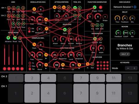
    Any help with this? I feel like I make connections that work, but not the sequencers or quantizers or a few key units in there.... I love this but am stuck. Thanks and here is my best so far or what I got:
  • Anyone up for sharing more screenshots of patches?

Sign In or Register to comment.