

Loopy Pro: Create music, your way.
What is Loopy Pro? — Loopy Pro is a powerful, flexible, and intuitive live looper, sampler, clip launcher and DAW for iPhone and iPad. At its core, it allows you to record and layer sounds in real-time to create complex musical arrangements. But it doesn’t stop there—Loopy Pro offers advanced tools to customize your workflow, build dynamic performance setups, and create a seamless connection between instruments, effects, and external gear.
Use it for live looping, sequencing, arranging, mixing, and much more. Whether you're a live performer, a producer, or just experimenting with sound, Loopy Pro helps you take control of your creative process.
Download on the App StoreLoopy Pro is your all-in-one musical toolkit. Try it for free today.
Comments
See?
Just go for white paint. Unless you have VERY explosive bowels.
Couldn’t agree more - fantastic app but probably the worst iOS interface I have ever seen!
Gentlemen I think some need to reread the orignal post.
This thread is not intended to argue over who likes yellow more than green, thin lines or thick etc. This is for US, the users, to voice to the developers that, although sonically their app is great, visually it needs improvement in order to be used in a more functional and enjoyable way.
Please lets stay on point.
-Cheerio
That’s a really interesting point to bring up! I can totally see how that would be a turn off looks wise for a lot of people. I wonder if the visibility in sunlight and with screen reflection is actually decreased by dark backgrounds (vs light backgrounds) though. Another possibility is that what decreases visibility in high lighting conditions is too little light/dark contrasts - a lot of UIs these days (including light background ones) tend to go for low to medium contrast in the brightness of the main shades - eg lighter grays paired with darker grays instead of extremes like black on white. (E-l-s-a is a great example of how that tendency towards lower contrasts can be implemented in both light and dark themes.)
I mean, I got in the habit of using invert colors in Mac OS and iOS whenever I’m reading or writing black characters on white backgrounds. I’m not sure if you’d find the same results, but for me white characters on black background are no harder to read as the invert in high lighting conditions. One way to test this is using the invert colors function in ios’s accessibility settings. I’d be curious to hear your take on how invert color affects visibility in high lighting.
IMO there’s a good reason for this push for low-medium brightness contrasts in UIs: it makes brightness contrasts on screens blend more seamlessly with the brightness contrasts in things around us. (I mean, the contrast between white and black on modern backlit screens tends to be way more extreme than anything surrounding the screen.) But the downside of going for lower-medium brightness contrast on UIs is lower visibity in high lighting, as you point out..
It says a lot about this place these days when the negative thread has 3 x the views and twice the comments than the positive thread does.
Until you’ve put it through a serious PA!
I realised today that I was so put off by Korg Electriba Wave that I’ve never even bothered to check what the fuss was all about. I have to say that same thing about GR-16.
It would be interesting and instructive if when people post about a UI they don’t like, they said exactly why, and then offset that with an example of an app that gets it right in that same aspect.
One should expect and accept that there will be people who feel exactly the opposite, and not even bother to post if not prepared to let that be.
@ohwell you are correct in saying its a contrast issue, and I have a much harder time viewing dark interfaces when outdoors. These are mobile devices after all. Amazon’s own music app is maybe the worst of all with the black on black on black interface. Awful.
I'll spare you from breaking down my gut feeling.")
I’m interested in whether people feel the grid pictured below, from the piano roll of a recently released app is usable? I’ve mentioned in other threads that to me it’s horrible to use due to the low contrast, and not had others mention they agree. Am I just contrast impaired or something?
For people like me who are a little color blind, contrast is extremely important.
I can't do anything with this contrast here. This app would be unusable for me! 😩
That’s why I also mentioned this UI in this thread...
That is really hard to see.
I find that some dark themed apps make me have to crank up the screen brightness.
Then my battery dies quicker, which sucks.
Example,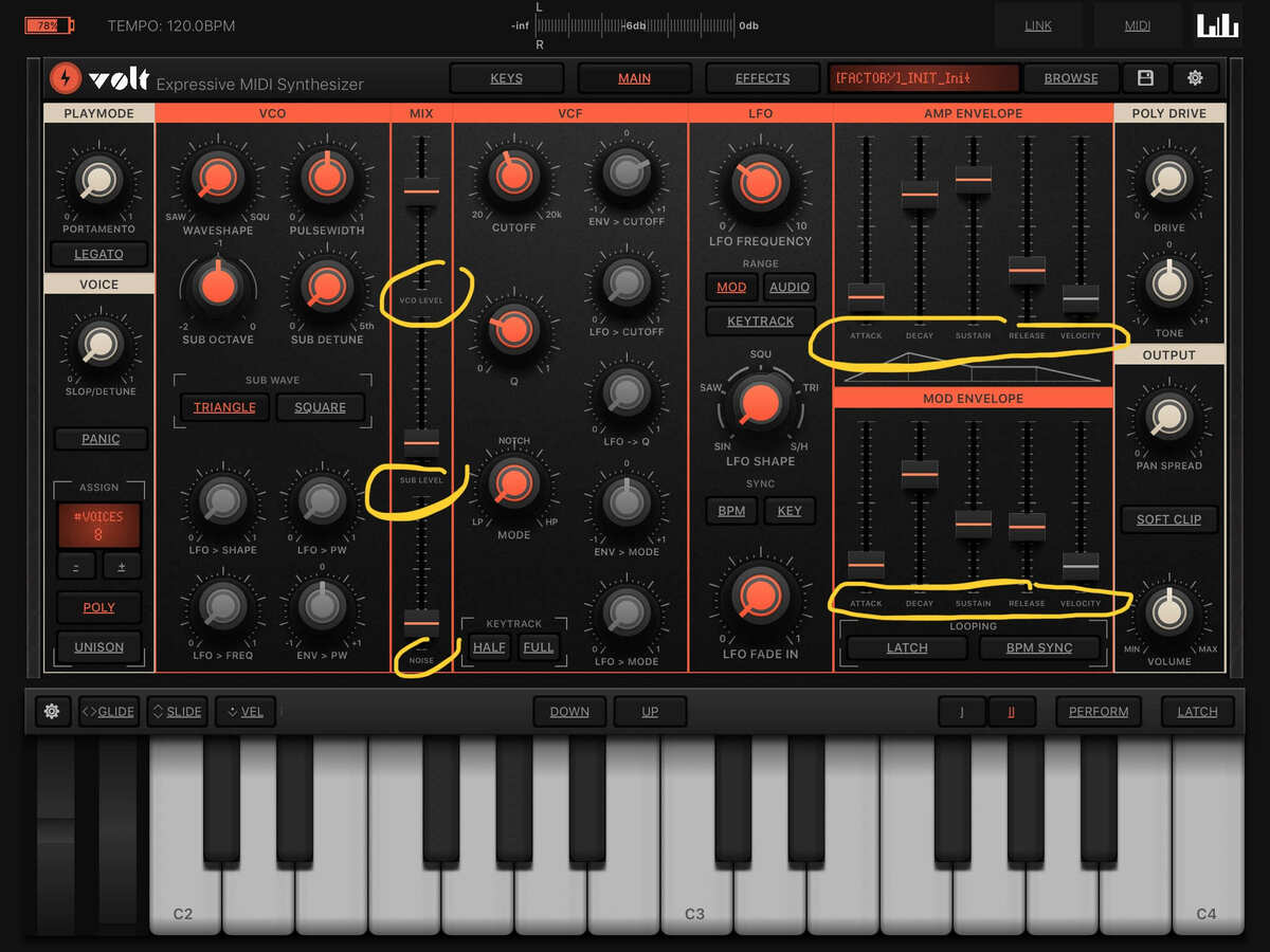
too small
A bit dark....also keeping in mind many of us use a midi keyboard/contraller, so that puts the ipad a bit further away.

Perfection👌🏼
I sometimes think developers make their color and contrast choices on the development environment emulators running on their high-end desktop monitors, and don’t really use the apps on the devices themselves.
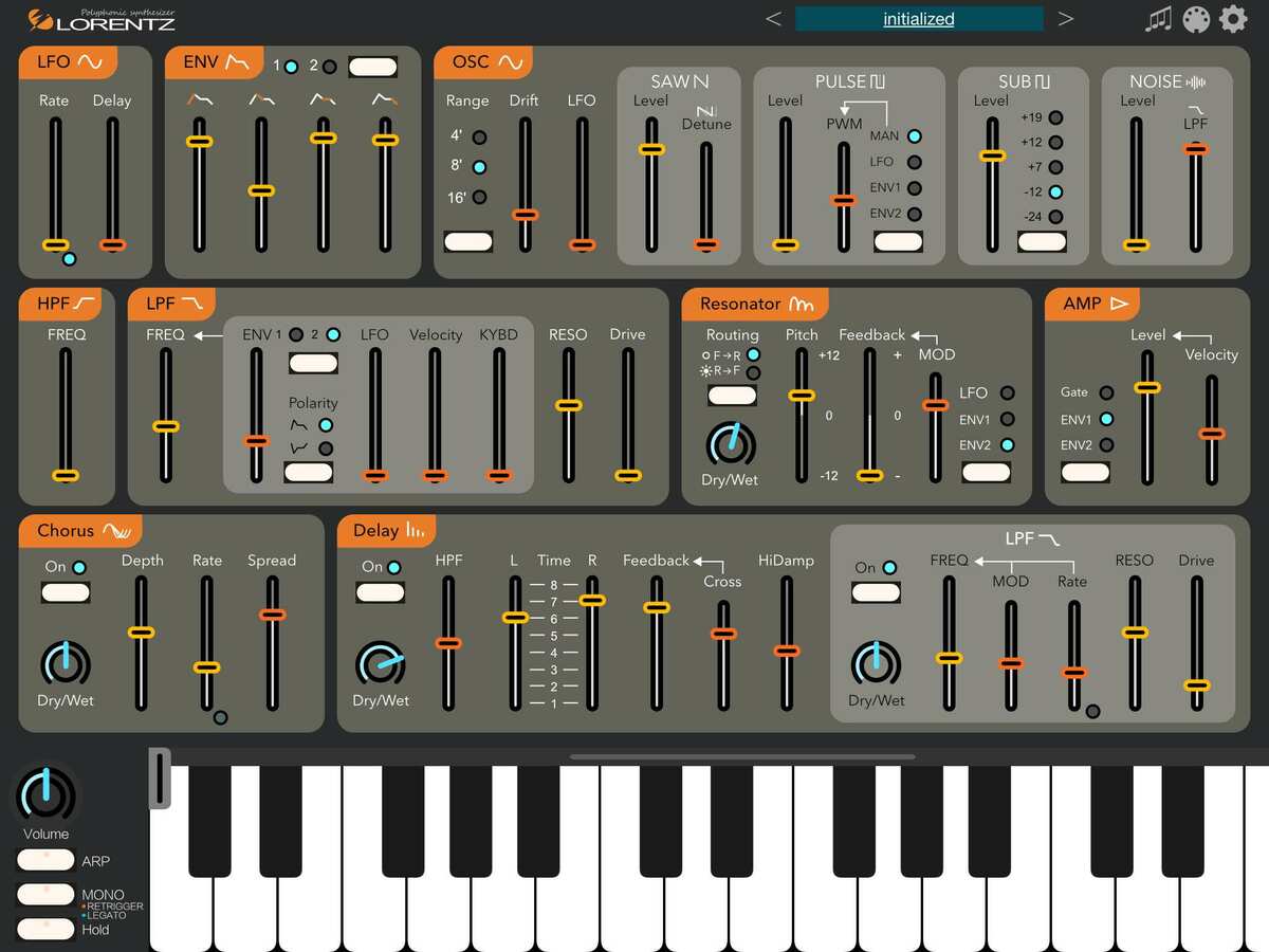
Agree on the Lorentz interface. 👍 though I can see how some people might disagree. IMO, the font sizes are the generally same as on Volt, but are so much more readable due to the better contrast.
Agreed!
Compare with Xequence (screenshot below is iPhone) which IMO does a great job at using much more contrast on a dark sequencer without letting things get jarring.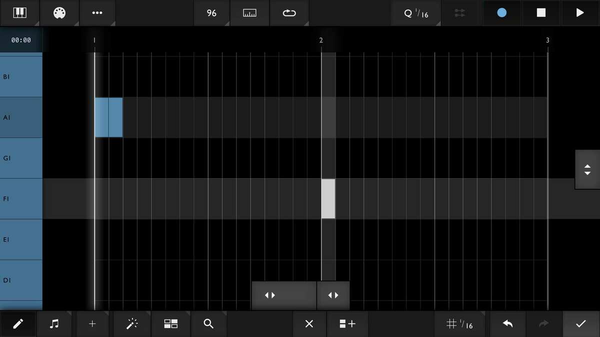
Elsa light is the rare example of a low contrast light background UI. Compare with the increased contrast in Elsa dark:
Re: Volt, you squint to see that control once and then you know that those four sliders are A D S R.
Re: Elsa. Sheesh. Can it be more cryptic? If I wanted a game or a Rubic's cube I'd buy one. But, I did buy it ....")
A great way to test contrast is to use the greyscale filter in the accessibility iOS menu. Here is an approximation of what Spacecraft looks like in greyscale (I edited the screenshot to remove color). Great example of a higher contrast dark color scheme imo.
For my taste, Tardigrain is a perfect example of a mid contrast (dark) color scheme that finds a great balance between the viewing comfort lower contrast enables with good readability/intelligibility in normal conditions. IMO one of the tricks that enables Tardigrain to maintain very high readability despite lower brightness contrast is the use of strong color contrast. Especially obvious when we compare with greyscale, which is much harder to read.
Yeh, that’s pretty good. Keeps the low-contrast crowd happy, but still pretty useable. I still prefer a bit more contrast myself, but can live at those levels.
@wim I added a short comment to my above post: I’m guessing the trick Erik uses is to rely on strong color contrast to counterbalance the lower brightness contrast. Does that seem plausible?
@ohwell, I dunno. Yes, the high color contrast makes the parts he wants to pop out stand out strongly, but there’s also a lot of brightness contrast there too. It works because it’s not overwhelming in the amount of screen used. The parts I was looking at are the black and grey of the grid. There’s little contrast in color or brightness, but enough (marginally) to be useable in my eyes - as opposed to the screenshot I posted further up of another app.
DISCLAIMER: I know nothing about graphic design. I only know what works for me and doesn’t.
@wim I’m no graphic design buff either. But your observations are helpful to me, so I consider them valuable.")
You mean the grid on tardigrain (not Xequence), right? (Basically the bottom half of the screen?) You’re making me notice how the the UI uses line thickness to compensate for lower contrast. Lower contrast (grey) lines seem about double the thickness of high contrast (black) lines.
Too cute
Photophore needs more contrast for the keyboard. The white keys are pretty dark yet visible, but the black keys are almost invisible against the dark background.
Like the Cubasis colour scheme and UI. Don’t like the layout. Don’t expect it to change ever so I only use it for audio arrangement.